February 27, 2008

Lab 3: Super Awesome NFL Flash Map


Lab 3 caused me considerable consternation due to a setting with which I was unfamiliar. Note to self and all others: when you want to make text into a button, make sure that the text is of type "Static Text" and not "Input Text". It just won't work any other way.

Map of Considerable Interest #5


(Link: http://www.nytimes.com/packages/html/politics/2004_ELECTIONGUIDE_GRAPHIC/)

Map of Considerable Interest #5 is an interactive New York Times map of the 2004 Presidential Election. It offers current and historical data on how each state hadgone in previous elections and makes clear at a glance where the Republican and Democratic power bases were at the time.

The map combines the use of clicks and hovering to show lots of information in a small package. Hovering over each state gives historical results for that state, while clicking on the buttons at the top change the view. The default view is of a standard political map of the United States, but the view can be changed to that of a map showing each state sized by how many electoral votes it has. The swing states can also be singled out for viewing.

The combination of slick graphics and ease of use make the 2004 Presidental Election map an effective tool in giving the reader and quick and easy-to-understand overview of how the race was shaping up going into the election.

February 20, 2008

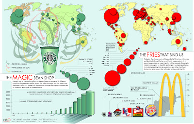
Map of Considerable Interest #4


(Source: http://www.princeton.edu/%7Eina/infographics/starbucks.html)

Map of Considerable Interest #4 shows the impact of globalization upon Starbucks and McDonald's and, in turn, their own impact upon the world. The map is actually two smaller maps, one showing Starbucks' penetration into world markets and the sources of the products that go into a cup of its coffee, and the other showing McDonald's market presence worldwide. The maps are well-designed and the graphic quality is high.

The Starbucks map does a fine job of illustrating just how many different countries contribute to its products, though the companion message of its market penetration can be lost in the emphasis of the graphics. The McDonald's map sticks to a single message of its market penetration and illustrates clearly that while it is still first and foremost an American chain, it has considerable market presence around Europe and Asia.

The accompanying charts tell additional stories. The Starbucks chart shows the company's explosive growth, and the McDonald's chart shows how its sales stack up with its competitors as well as the GDP of Afghanistan. The unmistakeable message from both charts is clear: Starbucks and McDonald's are global juggernauts.

February 13, 2008

Lab 2: The New York Football Giants


This week's assignment was to create a Flash map of the country depicting all of the games of the New York Giants or the New England Patriots for the 2007-08 NFL season. As an Eagles fan, I chose to do the Giants because that would allow the Eagles' logo to appear twice instead of only once for the Patriots (though, sadly, the Eagles lost to the Giants both times.)

Had I remembered when I started that the Giants played a game at Wembeley Stadium in London, UK this season, I might have gone with the Patriots, instead.

In any case, I quickly decided that I'd put each opponent's logo in the correct location of the game geographically and include some text with information about the game. To show the Giants playing at Miami in London, I downloaded a shapefile of the shape of the UK off the internet, loaded it in ArcMap, changed its projection to UTM to make the nation less squishy, and exported it to Encapsulated PostScript format, which Flash was able to read without a problem. After that, it was just a bunch of work but never too difficult.

February 12, 2008

Map of Considerable Interest #3


Map of Considerable Interest #3 is the system map for the Fairfax City CUE Bus service. As Fairfax City is a small jurisdiction, the map does not have to cover much area or many routes, but as a result, the map is clean and easy to read. The choice of colors is attractive and makes clear where the historic and commercial districts lie. The thick, white roads stand out well again the pale, neutral background.

(Source:http://www.fairfaxva.gov/cueBus/CUEBusMap.pdf)

February 6, 2008

Map of Considerable Interest #2


This week's map of considerable interest is a map of the individual football games CBS would be showing in various parts of the country at 1 PM on December 31, 2006. I did not choose this map for its fine graphics, incredible details, or overall attractiveness. I chose it because it is an example of how a map can be decidely mediocre in its presentation but immensely useful in its function. Essentially, anyone looking at the map can tell at a glance which football game will be on in that person's area. Surprisingly, it can be difficult to tell from typical television listings which of the several games going on at once will be shown in a viewer's market, as looking at national listings would like show nothing more than "NFL Football" for three hours, while localized listings may be harder to find.

It is also possible to deduce the network's beliefs about which games are of interest to which parts of the country. On this particular day, a wide swath of the country got the Jacksonville-Kansas City game, though much of the physical area receiving that game was a portion of the country that is not densely populated. Some oddities are apparent in the map, as well, such as the parts of Nevada, California, and Oregon receiving the New England-Tennessee game and large parts of Texas getting that game as well instead of the Cleveland-Houston game. Presumably, southern Florida got the Oakland-New York Jets game due to the perceived large number of New York retirees living in south Florida.

(Source: http://www.gribblenation.net/nflmaps)