April 30, 2008

Final Project: Interactive Transit Map


The final project is a "Flashifying" of a transit map of the vicinity of the Springfield Mall. It was an interesting project, as I essentially adapted a map I'd made at work for the Flash format and added interactivity. There's an instructions button in the file, so I'll say nothing more.

April 22, 2008

Lab 10: A Monocameral View of the Giants' Season


For the final lab of the term, I chose to "camerify" my map of the Giants' season. The camera zooms to each game they played during the 2007-2008 season and hesitates for a second or two before moving on to the next game. I've also included pause and play buttons for........wait for it.......pausing and playing the animation.

April 16, 2008

Getting Tufte with Aesthetics and Data Density

Aesthetics

Tufte discusses ways to design maps with aesthetic concerns not only for how the map can be made to look nicer, but how aesthetics can be combined with the information being presented in the data to make a more effective map.

A clear order is established for the effectiveness of prose, tables, and graphics. In addition, there is discussion about how prose or tables can be made with some sort of graphic quality, such as the "data graphic" showing predictions versus actual numbers with words but in a graphic format. Tufte explains that data and graphics often compete against each other but should actually be used together to convey information. Words, though, should tell the viewer how to read the design of a graphic more than they should tell the user what to read from them.

Tufte also engages in a pretty intense discussion of the elements of the "friendly data graphic", in particular the manner in which serif fonts should be used (upper and lowercase letters), line widths should not all be the same, and graphics should favor a horizontal orientation.

He also seems quite pleased with himself on more than one occasion.


Data Density

Maps are just phenomenal at showing large amounts of data in a small space. Example after example of how we can see smaller and smaller things than the reader might have thought possible at first. Sadly, Tufte doesn't do much discussion of whether the user can actually interpret the information rather than just see it, but that's ok, because he's the expert.

Graphics with lots of information are better than graphics with little information, because graphic devoid of information leave the viewer questioning why there is so little information shown and what information has been left out. Fortunately, most graphics can be shrunk considerably thanks to the Shrink Principle, which states that "graphics can be shrunk way down."

He still seems quite pleased with himself.

April 10, 2008

Lab 9: Satellite Imagery of Hyrule


Lab 9 is an exciting exercise in preloading and moving from flash file to flash file. For the exercise, I continued the theme of last week's exercise, this time including some maps from earlier games in the Zelda series.

April 9, 2008

Lab 8: The Hero of Hyrule


Lab 8 demonstrates panning and zooming capabilities possible within Flash. The map is the Dark World map from the classic SNES game, The Legend of Zelda: A Link to the Past. The buttons were created in Illustrator and the scripting was provided by the instructor, so once a few issues were ironed out, the task wasn't too difficult.

April 2, 2008

Map of Interest #...I Forget


This week's map of interest is a map created by by Soon-Hyung Yook, Hawoong Jeong, and Albert-Laszlo Barabasi at the University of Notre Dame as part of their research in the network structure of the Internet.

It illustrates that there is really not much correlation between density of routers in an area and density of population. On the other hand, it does show that where there are lots of routers, there are lots of people. The color scheme is effective, as the darker and redder colors show where the densities are highest. The map probably could have used some country boundaries, though, to help illustrate exactly which countries have the densest populations and the most routers. Additionally, the map's "projection" is geographic, which really means that it is unprojected. An equal area projection would have been more suitable for this kind of map as density calculations are based upon area.

Abstract of Original Article

March 30, 2008

Lab 7: Rectangles, Popups, and Links to the Outside World


Ok, serious this time. I redid the shape tween because I just had way too many points to keep them from overlapping during the shape tweening, so the shape doesn't look as good as it did before but the shape tweening is better now. I added two popup windows to the bottom, one for project info and one for invasion info. I also added three links to the right side of the screen with more info.

March 26, 2008

Lab 6: The Invasion of Russia by Little Rectangles and a Blob


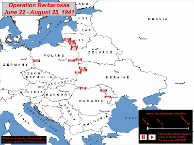
This week's lab follows on last week's lab, as we added a shape change showing the progression of the Nazis across eastern Europe. The morph works pretty well except for one part in the south where the morph is just a little too complicated for the software. Sadly, I didn't have to time to correct it completely before class, but the lesson here is to keep shapes as simple as possible for morphing in Flash. Otherwise, the map works well.

March 13, 2008

Lab 5: The Invasion of Russia by Little Rectangles


Lab 5 is an exercise in Flash animation. The subject is Operation Barbarossa (sadly, not Operation Barbaro.) It involved motion guides, motion tweens, and lots of graphics. It was a little tricky to figure out how to do the motion guides at first, but once I had it figured out, I finished them pretty quickly. The buttons weren't too hard, either, just a bit time-consuming. The only flaw with the buttons right now is that the vertical lines on the timeline are supposed to cause the timeline to jump, but only the rightmost one works reliably (the middle one is flaky, and the left one works not at all.) I can't really say why that is, but the dates themselves can be clicked on, so I'm not that upset.

March 5, 2008

Map of Considerable Interest #6


(Source:http://dcbid.cartifactmaps.com/)

This week's map is an interactive of downtown Los Angeles. The map allows the user to pan around the downtown area and has labels for most of the important buildings. It primarily concerns residential properties, and most residential properties can be clicked on to bring up detailed information about the property on the left side.

The information includes a street-level photograph of the property, its nearest intersection, the leasing and sales information, and the number of units it contains. Also included are the highest and lowest rental prices on the property and a brief description of it. The map is attractive and easy to understand, and it serves a useful purpose in allowing housing hunters to scan this portion of Los Angeles quickly and learn more about any intriguing areas.

March 1, 2008

Lab 4: Democratic President Election Performance: 1976-2004


Lab 4 is a map of the performance of the Democratic presidential candidates in elections from 1976-2004. Each year is its own layer in the map that can be turned on or off, and each layer is highly transparent. In this way, the user can turn on many years at once and see how Democratic a given state was through the selected years.

February 27, 2008

Lab 3: Super Awesome NFL Flash Map


Lab 3 caused me considerable consternation due to a setting with which I was unfamiliar. Note to self and all others: when you want to make text into a button, make sure that the text is of type "Static Text" and not "Input Text". It just won't work any other way.

Map of Considerable Interest #5


(Link: http://www.nytimes.com/packages/html/politics/2004_ELECTIONGUIDE_GRAPHIC/)

Map of Considerable Interest #5 is an interactive New York Times map of the 2004 Presidential Election. It offers current and historical data on how each state hadgone in previous elections and makes clear at a glance where the Republican and Democratic power bases were at the time.

The map combines the use of clicks and hovering to show lots of information in a small package. Hovering over each state gives historical results for that state, while clicking on the buttons at the top change the view. The default view is of a standard political map of the United States, but the view can be changed to that of a map showing each state sized by how many electoral votes it has. The swing states can also be singled out for viewing.

The combination of slick graphics and ease of use make the 2004 Presidental Election map an effective tool in giving the reader and quick and easy-to-understand overview of how the race was shaping up going into the election.

February 20, 2008

Map of Considerable Interest #4


(Source: http://www.princeton.edu/%7Eina/infographics/starbucks.html)

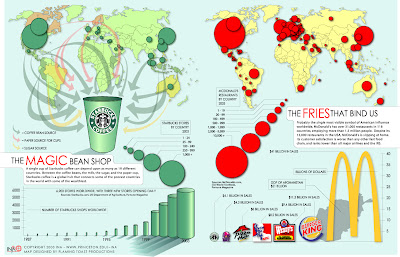
Map of Considerable Interest #4 shows the impact of globalization upon Starbucks and McDonald's and, in turn, their own impact upon the world. The map is actually two smaller maps, one showing Starbucks' penetration into world markets and the sources of the products that go into a cup of its coffee, and the other showing McDonald's market presence worldwide. The maps are well-designed and the graphic quality is high.

The Starbucks map does a fine job of illustrating just how many different countries contribute to its products, though the companion message of its market penetration can be lost in the emphasis of the graphics. The McDonald's map sticks to a single message of its market penetration and illustrates clearly that while it is still first and foremost an American chain, it has considerable market presence around Europe and Asia.

The accompanying charts tell additional stories. The Starbucks chart shows the company's explosive growth, and the McDonald's chart shows how its sales stack up with its competitors as well as the GDP of Afghanistan. The unmistakeable message from both charts is clear: Starbucks and McDonald's are global juggernauts.

February 13, 2008

Lab 2: The New York Football Giants


This week's assignment was to create a Flash map of the country depicting all of the games of the New York Giants or the New England Patriots for the 2007-08 NFL season. As an Eagles fan, I chose to do the Giants because that would allow the Eagles' logo to appear twice instead of only once for the Patriots (though, sadly, the Eagles lost to the Giants both times.)

Had I remembered when I started that the Giants played a game at Wembeley Stadium in London, UK this season, I might have gone with the Patriots, instead.

In any case, I quickly decided that I'd put each opponent's logo in the correct location of the game geographically and include some text with information about the game. To show the Giants playing at Miami in London, I downloaded a shapefile of the shape of the UK off the internet, loaded it in ArcMap, changed its projection to UTM to make the nation less squishy, and exported it to Encapsulated PostScript format, which Flash was able to read without a problem. After that, it was just a bunch of work but never too difficult.

February 12, 2008

Map of Considerable Interest #3


Map of Considerable Interest #3 is the system map for the Fairfax City CUE Bus service. As Fairfax City is a small jurisdiction, the map does not have to cover much area or many routes, but as a result, the map is clean and easy to read. The choice of colors is attractive and makes clear where the historic and commercial districts lie. The thick, white roads stand out well again the pale, neutral background.

(Source:http://www.fairfaxva.gov/cueBus/CUEBusMap.pdf)

February 6, 2008

Map of Considerable Interest #2


This week's map of considerable interest is a map of the individual football games CBS would be showing in various parts of the country at 1 PM on December 31, 2006. I did not choose this map for its fine graphics, incredible details, or overall attractiveness. I chose it because it is an example of how a map can be decidely mediocre in its presentation but immensely useful in its function. Essentially, anyone looking at the map can tell at a glance which football game will be on in that person's area. Surprisingly, it can be difficult to tell from typical television listings which of the several games going on at once will be shown in a viewer's market, as looking at national listings would like show nothing more than "NFL Football" for three hours, while localized listings may be harder to find.

It is also possible to deduce the network's beliefs about which games are of interest to which parts of the country. On this particular day, a wide swath of the country got the Jacksonville-Kansas City game, though much of the physical area receiving that game was a portion of the country that is not densely populated. Some oddities are apparent in the map, as well, such as the parts of Nevada, California, and Oregon receiving the New England-Tennessee game and large parts of Texas getting that game as well instead of the Cleveland-Houston game. Presumably, southern Florida got the Oakland-New York Jets game due to the perceived large number of New York retirees living in south Florida.

(Source: http://www.gribblenation.net/nflmaps)

January 30, 2008

Lab 1: Super Tuesday


With the 2008 primary season having been underway since 2007, this week's assignment is to make a simple map in Flash of either the Republican or Democratic primaries leading up to Super Tuesday. I chose to do the Republican primaries, and I've also chosen to show the states that each candidate has already won. I think it turned out pretty well for my first time using Flash.

January 27, 2008

New York Times' 2006 Midterm Elections Map


I was greatly impressed when I came across this 2006 Midterm Elections map by the New York Times. It's Flash-based, meaning that I can't imbed more than a screenshot of one of its maps, but the screenshot gives the general idea.

Essentially, it is a collection of maps about the midterm elections, divided into several categories. The most basic maps are the maps of the Democratic and Republican gains and holds in the Senate, House, and governor races. The color-coding system makes it easy to see at a glance how many states each party held and won, and it is clear right away that the Democrats made great gains in that election. The states can be shown with their standard political boundaries or they can be distorted by population, showing which states have the most influence in Congress and how those states are divided between Democratic and Republican representation.

The maps make good use of rollovers, as hovering the mouse on various features brings up additional statistics, such as voting percentages. The interface is clean and easy to understand, and it communicates the results without cluttering the interface with meaningless content. The map succeeds at its primary goal and does so in an attractive fashion.

January 24, 2008

Linkage

I've added a few useful links for cartographers and GIS users on the right in addition to the standard class links.


  • ESRI is the company that makes ArcGIS, and if you're not familiar with ArcGIS, you will be soon.

  • The National Atlas is a useful resource for anyone interested in maps of the United States, but it's especially useful for the GIS data it provides free of charge, including information on boundaries, climate, transportation, geology, agriculture, hydrology, and more.

  • The USDA Geospatial Data Gateway is a terrific place to go for free, recent aerial imagery of the United States. The only real downside is that the imagery can be rather large (hundreds of megabytes) and imagery requests often take a little while to be processed (from minutes to hours) but the products are well worth the trouble. Also, the site uses Java so it may not work behind some corporate firewalls. Otherwise, though, it's great.

  • "Google Maps," as Andy Samberg and Chris Parnell put it, "is the best. True dat. Double True!" Sure, Yahoo! Maps and MapQuest can be used to find the dopest route, but I prefer Google Maps' interface and the way that you can drag routes it suggests to reroute to various stops or onto specific roads. It also overlays traffic conditions for many metropolitan areas.

  • Topozone is a good place to go to look at USGS Quad maps. Actually downloading the maps for use in a GIS isn't free, but the site's interface is good for navigating to the desired site and viewing it at several different scales.